West Indies cricket has a rich and storied history, beginning in the late 19th century when the sport was introduced by British colonisers. The West Indies team, representing a group of Caribbean nations, played its first Test match in 1928. From the 1970s to the early 1990s, they dominated world cricket with legendary players like Clive Lloyd, Viv Richards, Malcolm Marshall, and Brian Lara. Known for their fast bowling and explosive batting, they won the first two Cricket World Cups (1975, 1979) and later T20 World Cups.
In recent years, West Indies cricket has faced significant challenges. With the growing popularity of domestic and international tournaments, many players have chosen to prioritise those opportunities over national duty. As a result, the team has struggled, missing out on World Cup qualifications and suffering a string of Test series defeats. However, a recent 8-run victory over Australia, on their home turf, has sparked a sense of renewed optimism.
My goal was to create a rebrand that reconnects people to West Indies' rich cricketing heritage while inspiring fresh hope and positivity. This brand aims to reignite pride and passion; honouring the legacy of the past while embracing a bold future.
Drawing from past versions of the West Indies brand, I developed a design that blends evolution with revolution. I retained iconic elements like the stumps and palm tree but reimagined them with a modern edge. The bowled stumps serve as a subtle nod to the fearsome and dominant West Indian bowling attacks of the 1970s; a golden era when our fast bowlers terrorised batting line-ups around the world. I also introduced a sophisticated monogram to elevate the identity.
Current logo vs Rebrand
To emphasise national pride, I incorporated the West Indian flag, reminding players of the honour and responsibility of representing a diverse and vibrant region. Maroon, a long-standing colour of West Indies cricket, remains central to the palette. A more refined, monochromatic colour scheme adds a sense of elegance and respect, reinforcing the enduring spirit of West Indies cricket.
Modern brand identity often embraces multiple emblems for a club, used across alternate kits or fashion lines. I wanted to take a similar approach. The alternative emblem features the newly designed monogram as the focal point, paired with "1920" — the year the team was formed — placed beneath it. This mark is intended primarily for the Test match kits. Given that Test kits are traditionally white or cream, this emblem ensures the team carries a refined and unified look, proudly representing their nation with a sense of heritage and purpose.
From left to right: Cricket West Indies, this the logo used by the cricketing board for internal and external promotional content. Primary Logo to be used for Player Suits & ODI & IT20 kits. Alternative monogram logo; to be used Test kit.
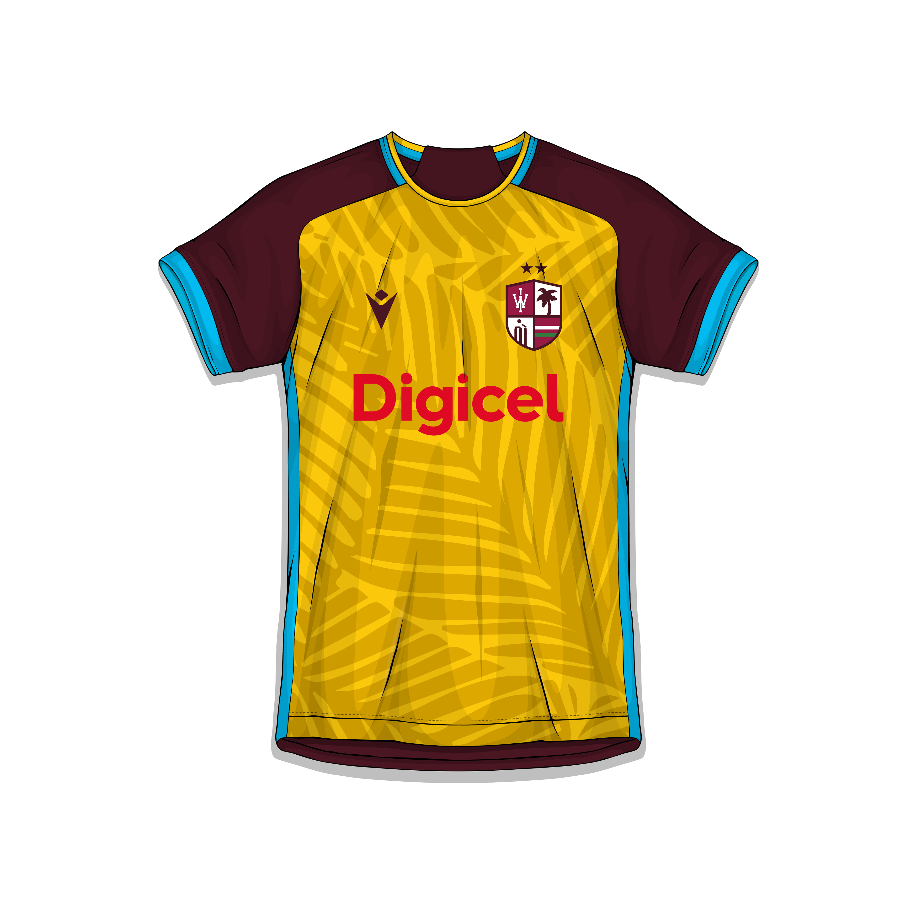
IT20
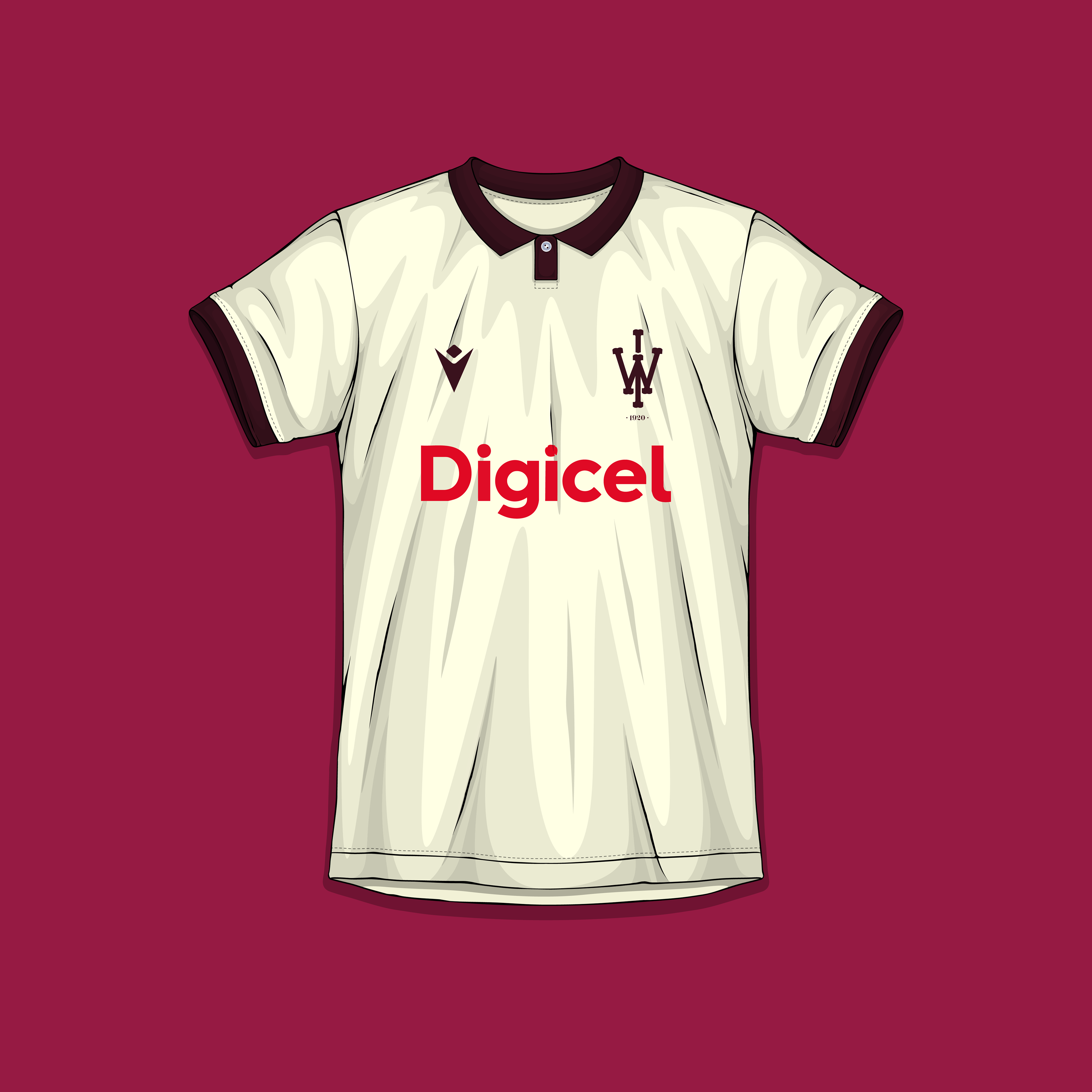
TEST
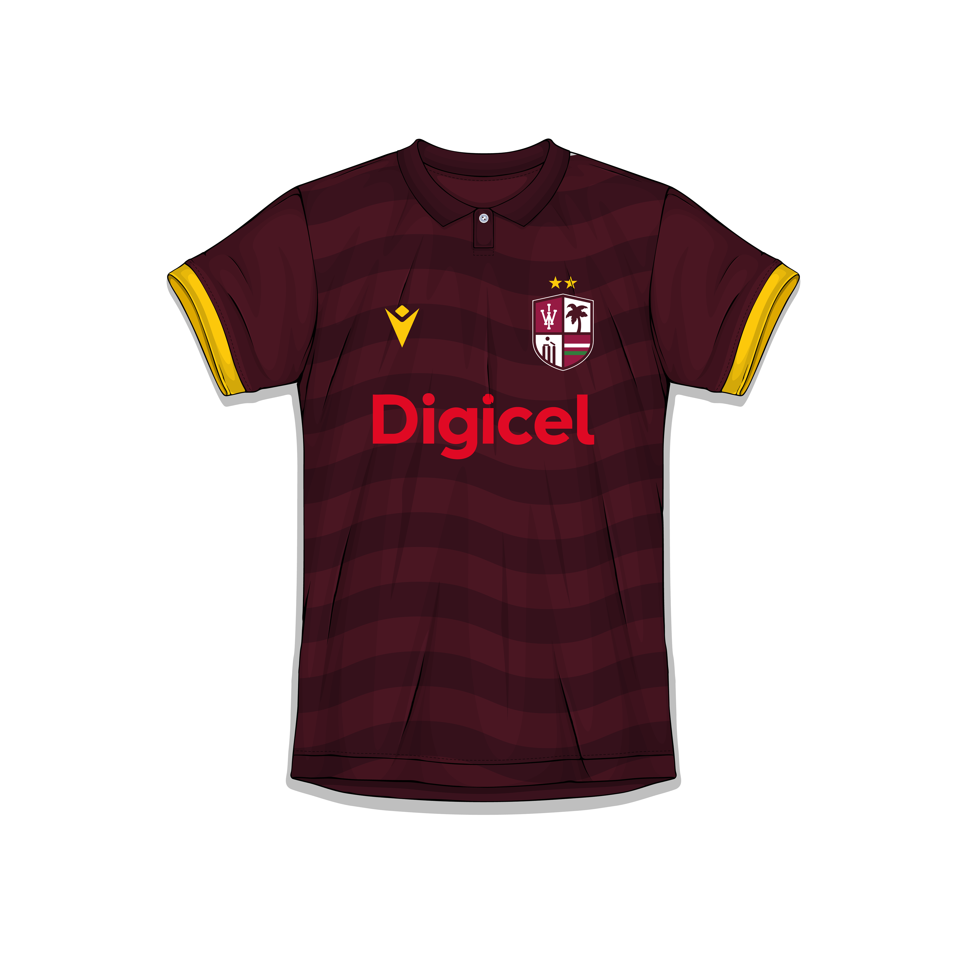
ODI
"Rally Round the West Indies" is a powerful calypso-inspired anthem written by David Rudder in 1987. It was adopted as the official anthem of the West Indies cricket team, uniting fans and players across the Caribbean with its message of resilience, pride, and regional unity. The song became a symbol of support during both triumphs and challenges on the field. For the rebrand, I chose to shorten the slogan to simply "Rally" — a bold, dramatic statement that captures the spirit of togetherness and determination, while staying true to the original anthem’s emotional impact.
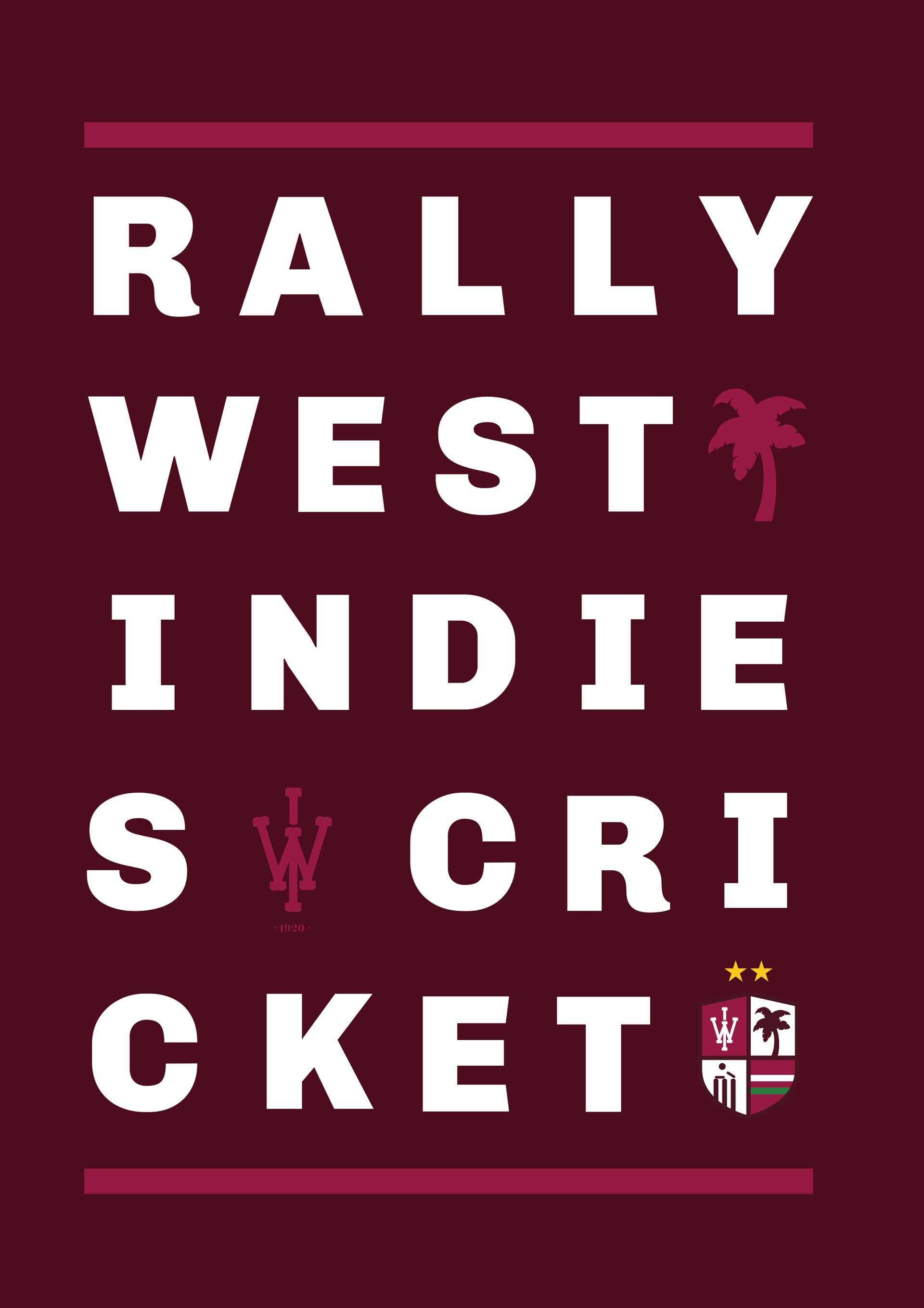
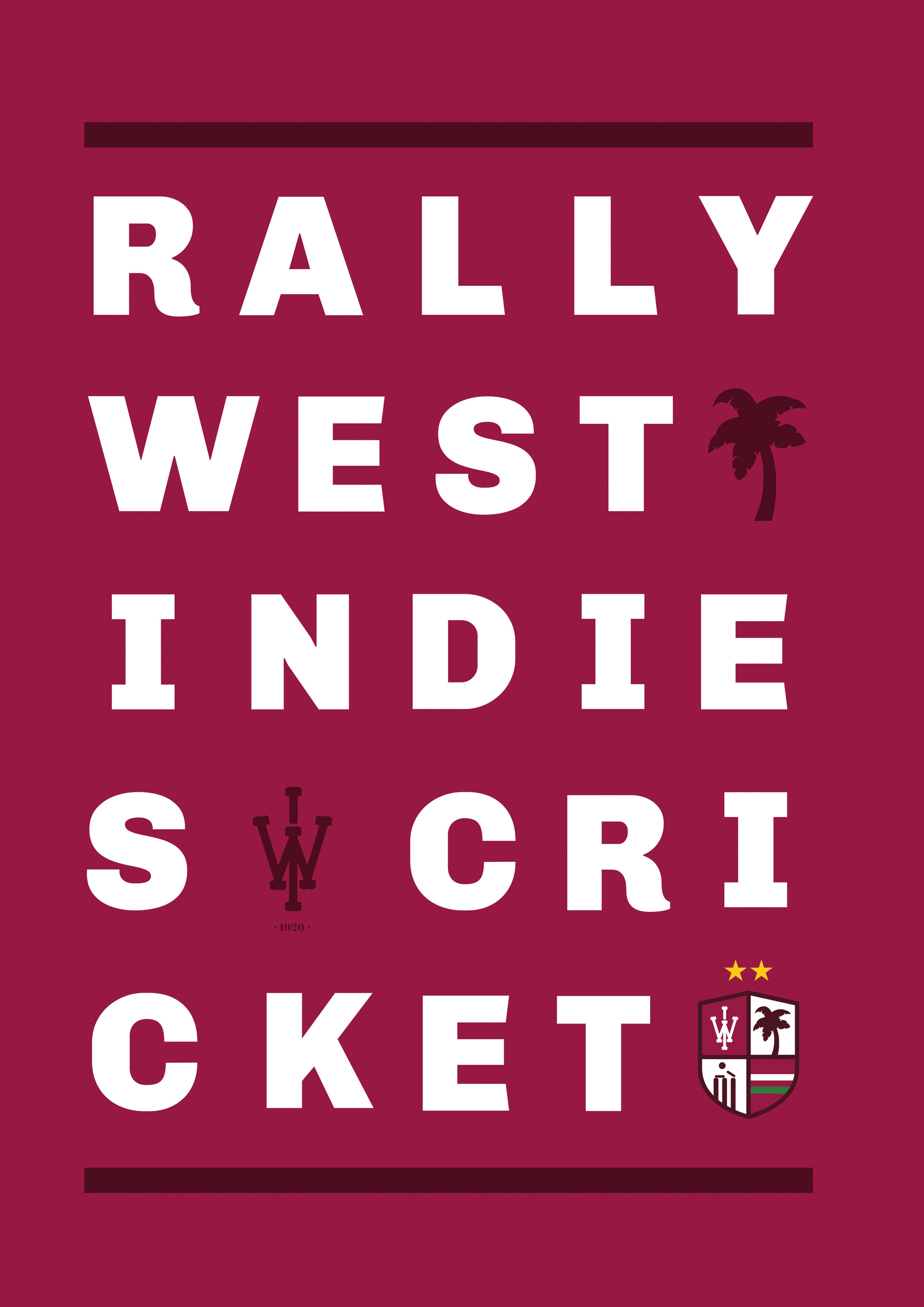
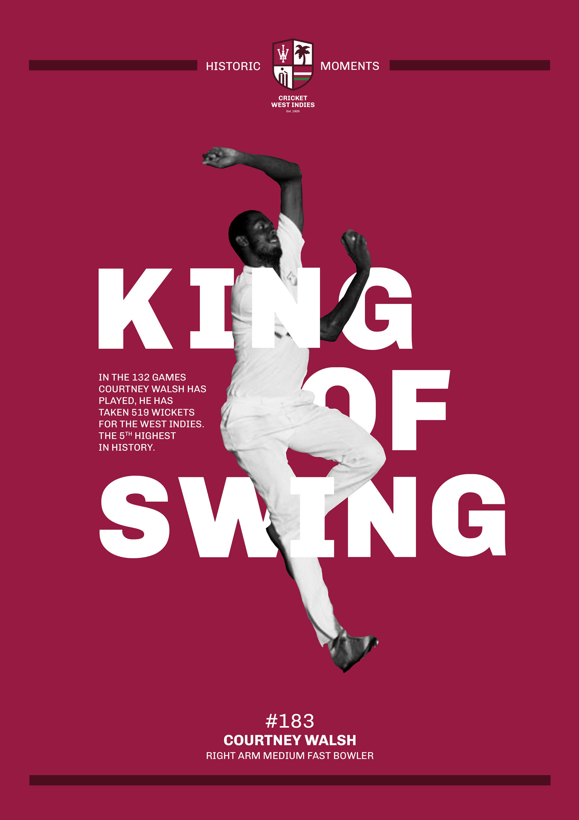
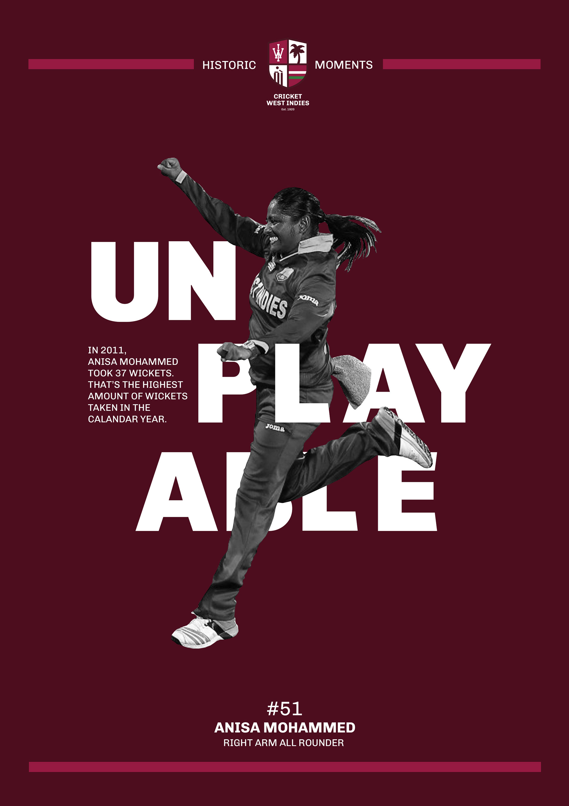
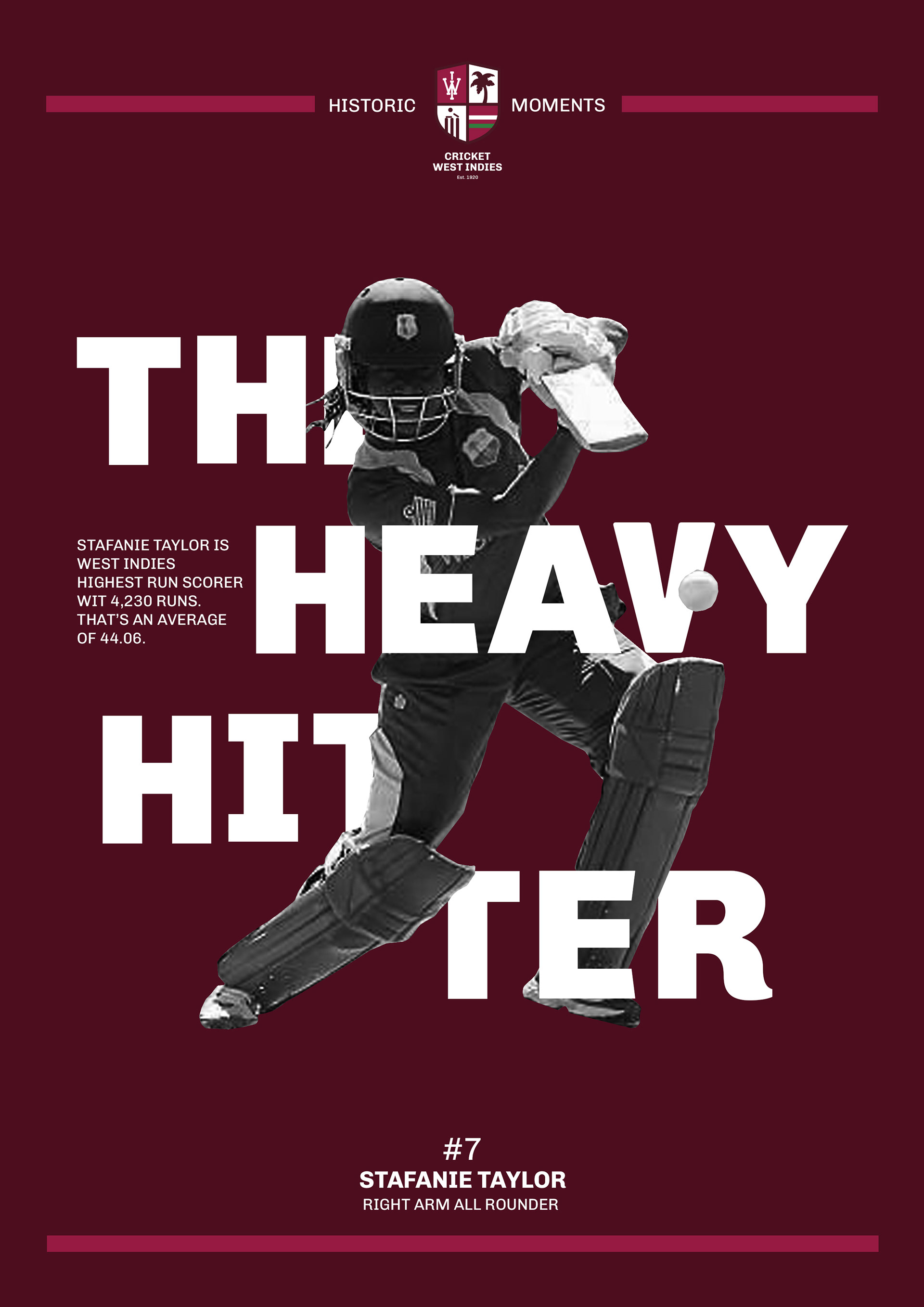
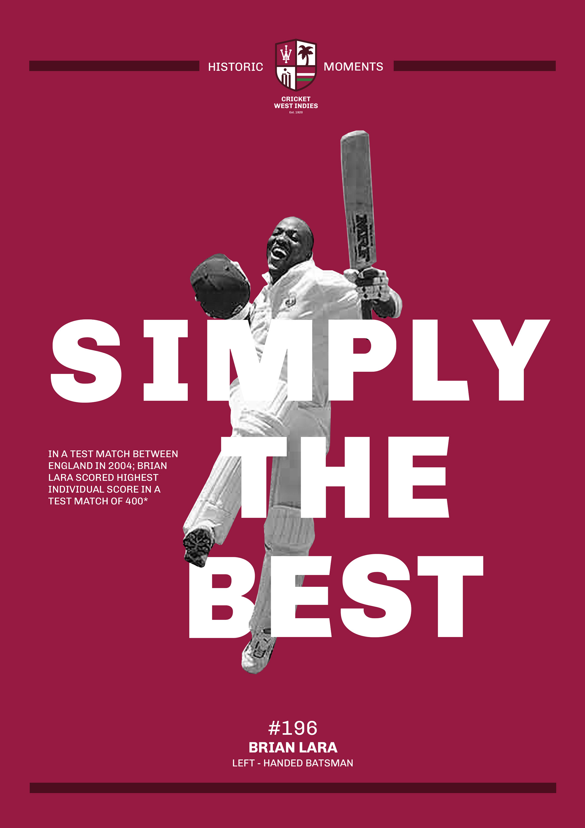
To further embrace and honour West Indies' rich heritage, I wanted to create a social media series titled "Historic Moments" — a celebration of the many men and women who have shaped West Indies cricket. This series would highlight key statistics and achievements of legendary retired players. The aim is twofold: to give the older generation a chance to reminisce about their heroes and to inspire the next generation to follow in their footsteps and drive the team toward future success. It's about remembering where we came from while motivating where we’re going.
