Whenever I travel, I’m always drawn to the branding and signage of local businesses and how these choices shape the type of customers they attract. While visiting Rome, I stumbled upon a café called Cheddar, known for serving incredible American diner-style food. However, the café’s aesthetic didn’t quite match the experience — the branding felt disconnected from the quality of the food.
There’s often a stereotype that if a place looks "badly" branded, the food is usually great — and Cheddar felt like one of those hidden gems that locals know and trust. But I wanted to challenge that notion with this rebrand concept.
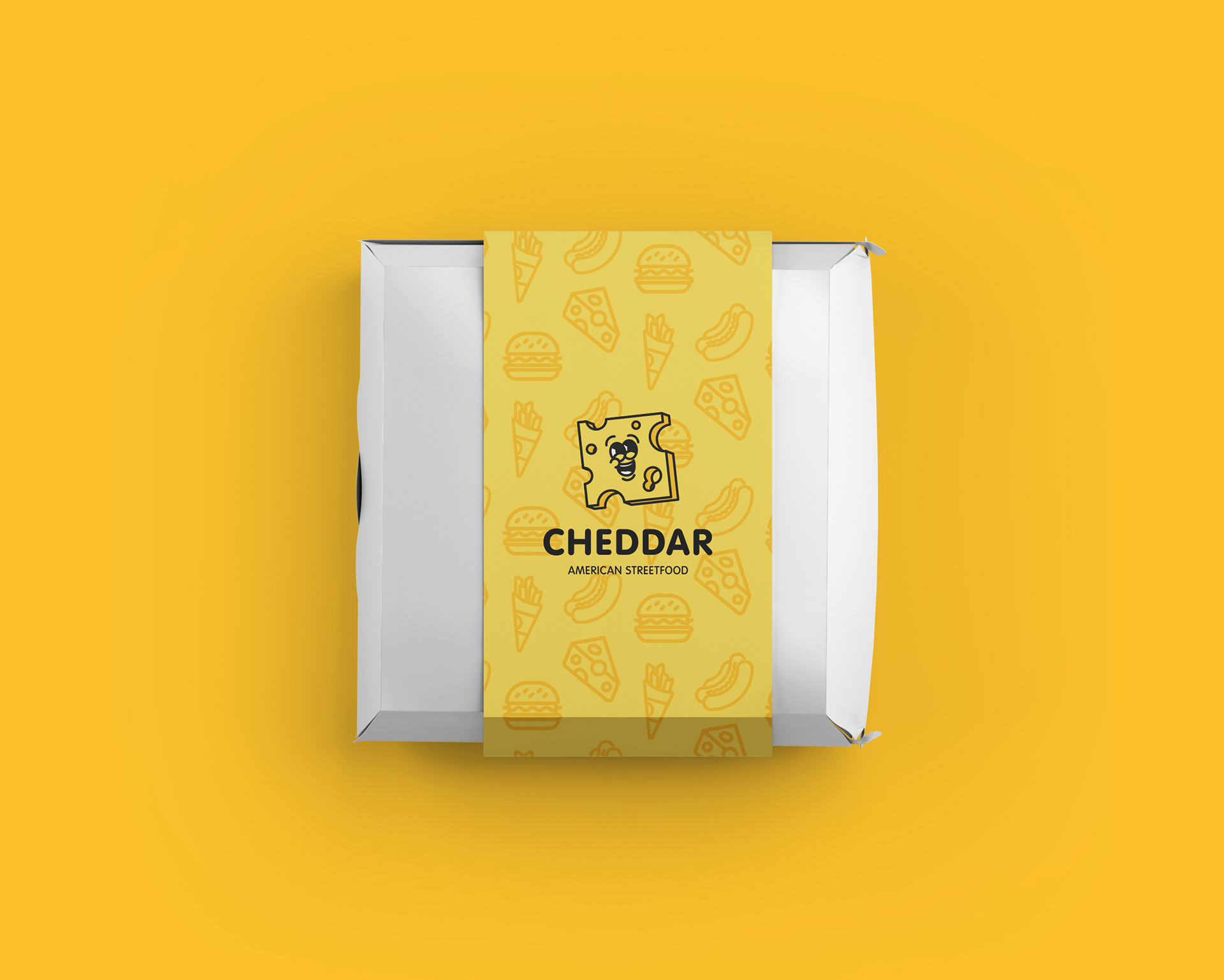
With a name like Cheddar, and no yellow in sight, I saw a huge missed opportunity. So I decided to make yellow the focal point of the new identity, creating something bold and memorable.
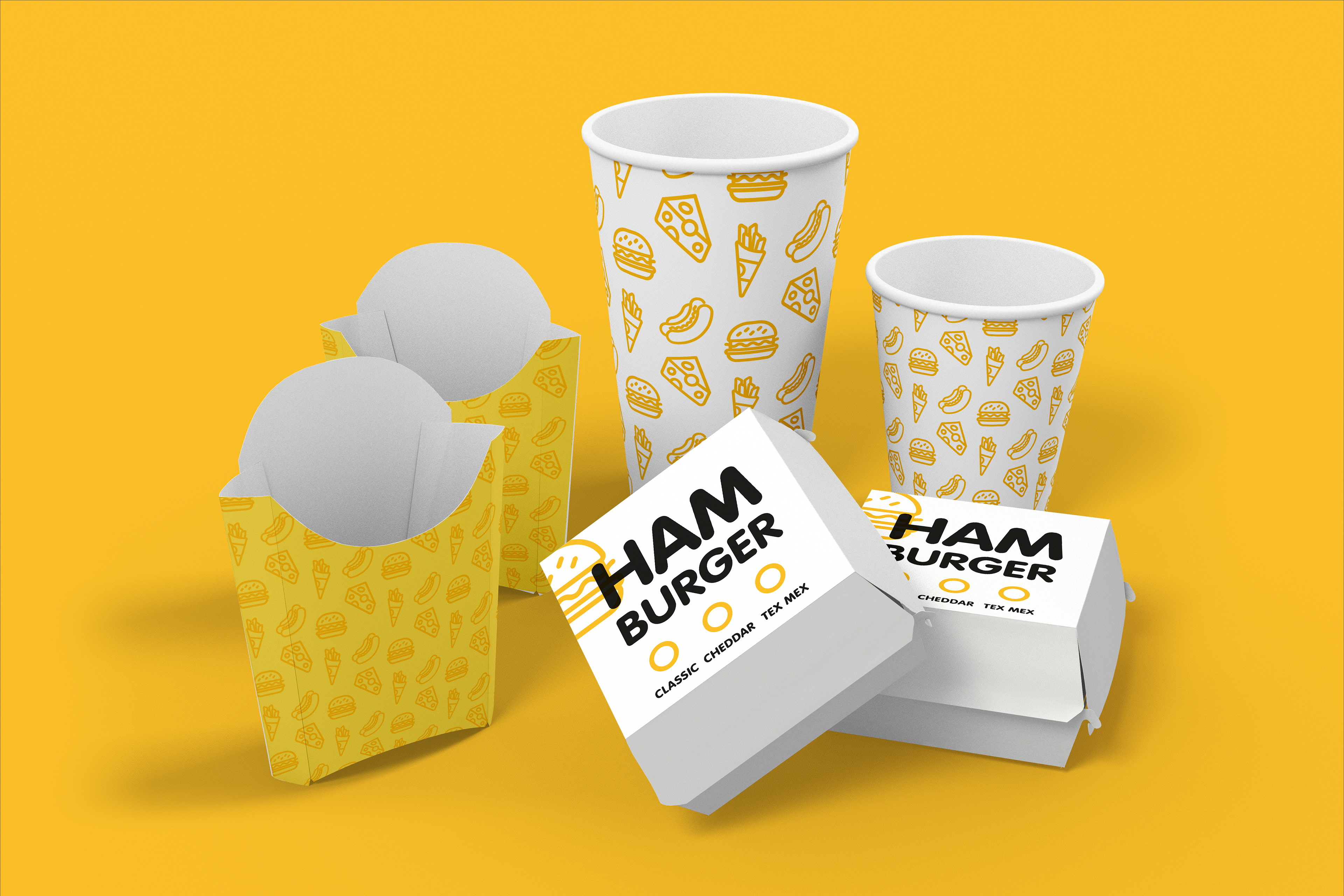
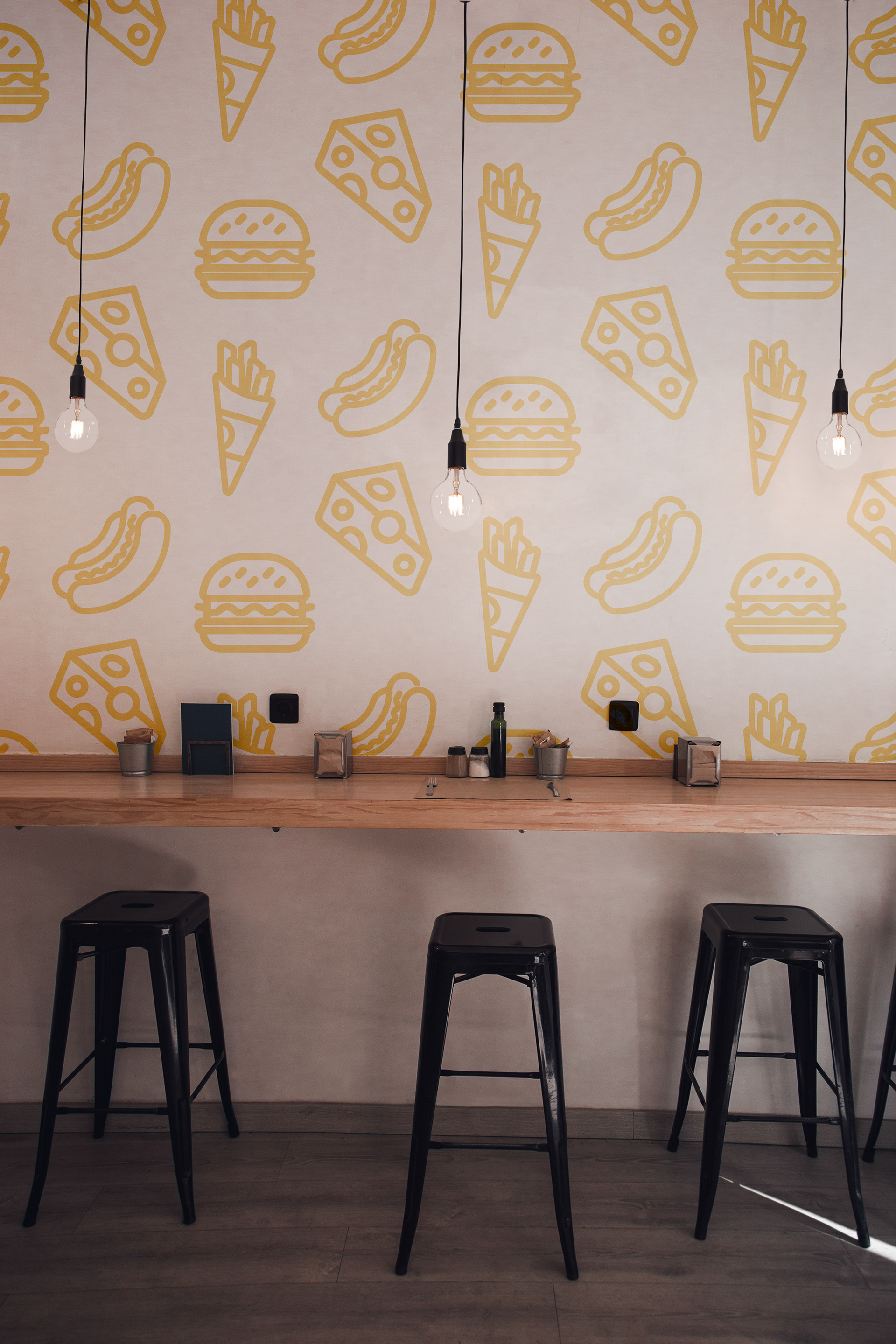
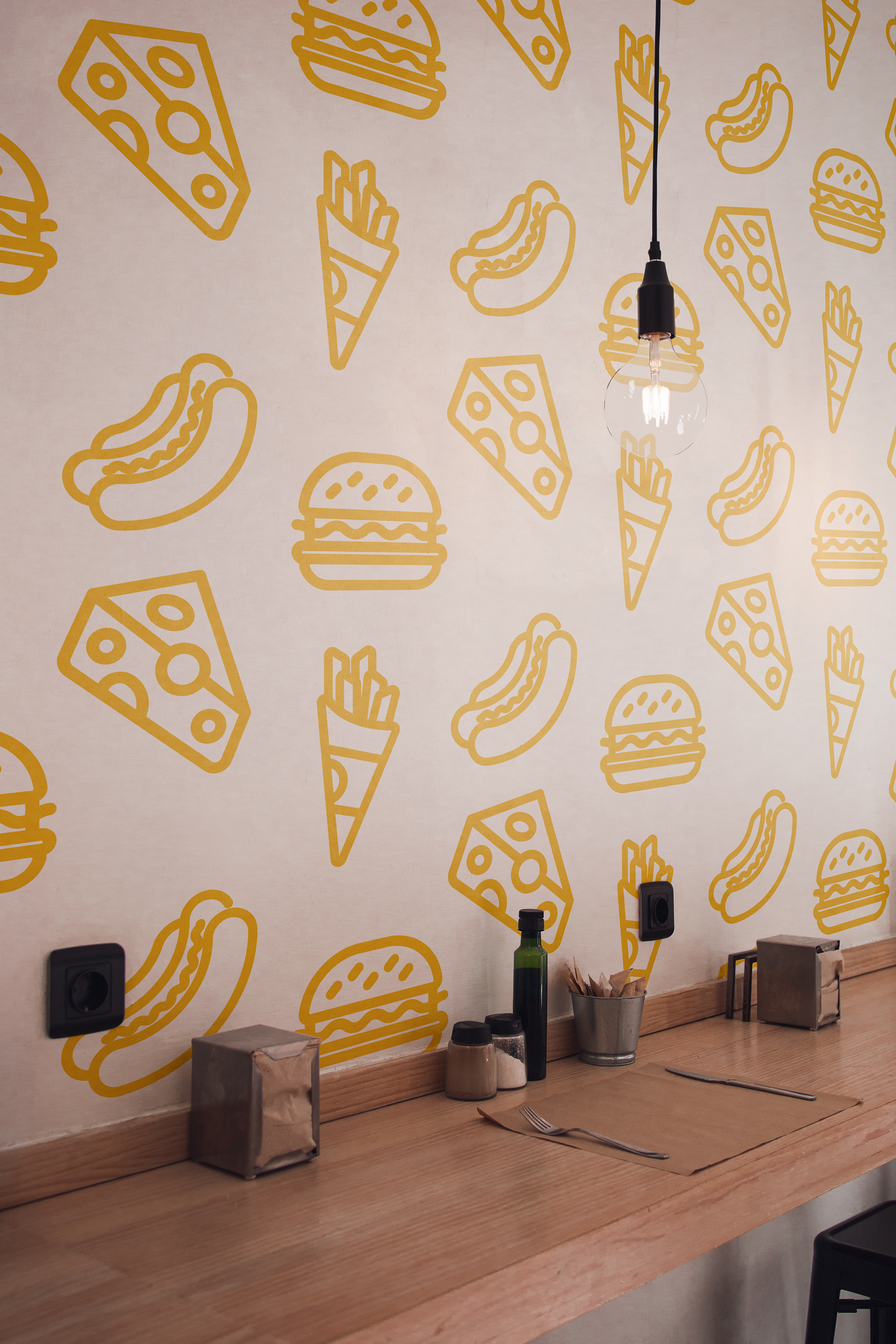
One staple of American diners and fast food brands is the use of mascots or playful characters as part of their identity. I wanted to embrace that idea, designing a character-led logo along with a set of custom icons to help tie the brand together. These icons could also double as decorative patterns — perfect for use across packaging, signage, and in-store design — giving the brand a flexible but cohesive visual language.
New Signage to be displayed outside.
New promotional brochure, with a more clean, minimal grid. Iconography to help with translation of each item section.
New packing with the brand's new pattern. Hamburgers can now use the same boxes, by using a tick box option to differentiate the burgers when packaging the orders.
