Hackney, located in the northeast of Greater London, has a rich history shaped by waves of migration and social change. Once a rural village, it grew rapidly during the Industrial Revolution and became home to diverse communities, from Huguenot weavers to Afro-Caribbean and Turkish families. Over time, Hackney has evolved into a vibrant cultural hub known for its creativity, resilience, and strong sense of community, while also grappling with challenges like gentrification and social inequality.
This is a conceptual rebrand of the London Borough of Hackney, a place I’ve called home all my life. Having grown up alongside Hackney’s current brand identity, I’ve witnessed firsthand how much the area and its community have transformed — for better and worse. What makes Hackney truly special is its people — a dynamic mix of ethnicities, backgrounds, and generations. The culture here has always been open and welcoming, offering something for everyone — whether it’s picking up groceries at Ridley Road Market or catching a show at Hackney Empire, there’s always something happening.
Over time, however, I’ve felt that Hackney’s current brand no longer reflects the vibrancy and diversity of the borough. Many residents feel that recent changes focus too heavily on new arrivals, often neglecting the existing communities that have shaped Hackney's identity. With this rebrand, I wanted to celebrate the borough’s diversity and warmth, creating a visual language that honors those who live here while remaining inviting to newcomers. Most importantly, I aimed to design a brand people can trust — one that feels relatable, inclusive, and genuinely representative of Hackney’s spirit.
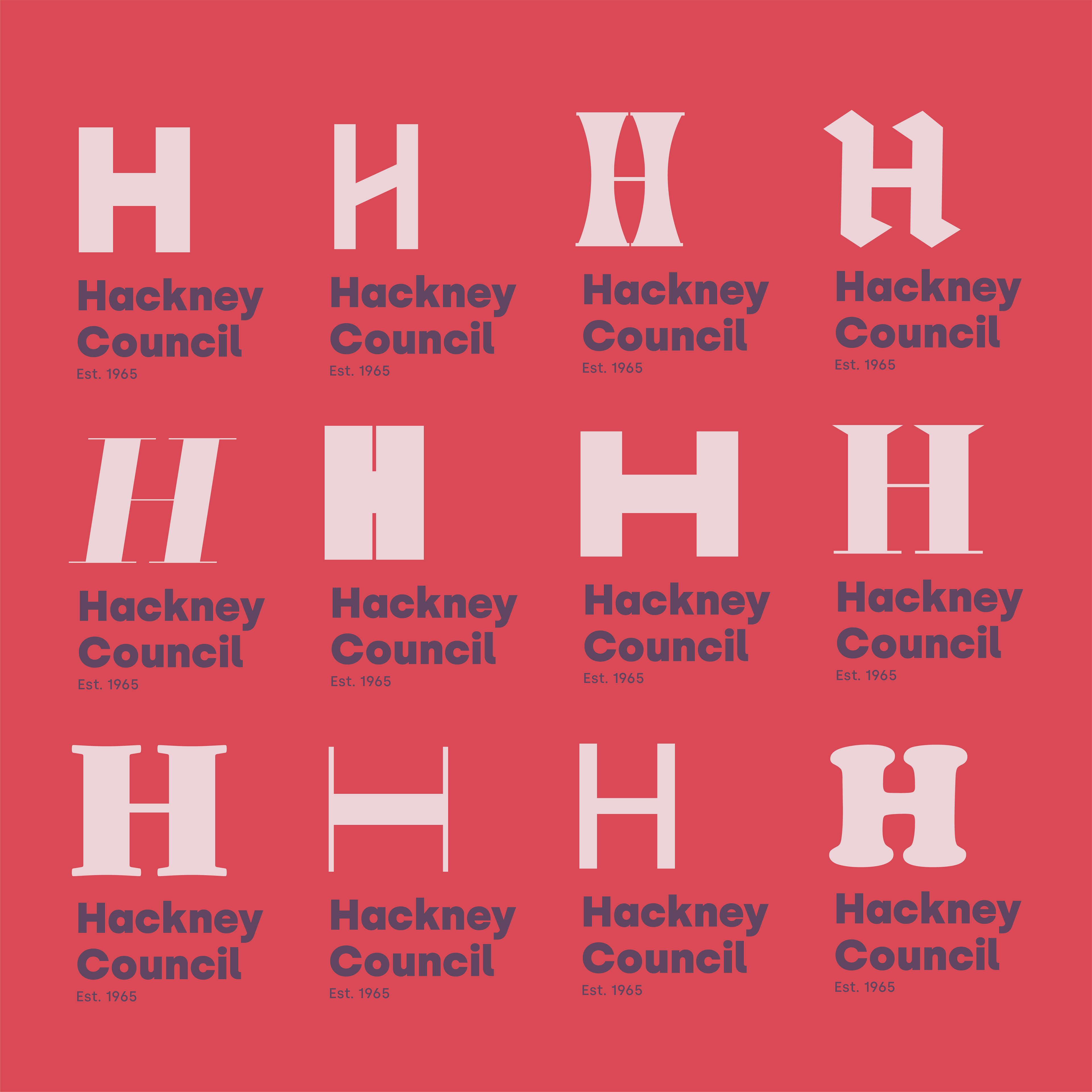
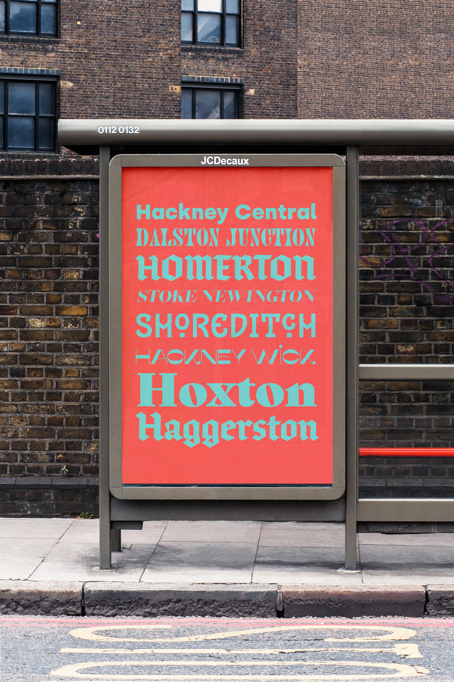
The rebrand features a core, limited color palette, with each primary color representing different sectors — for instance, a blue tone symbolizing the maintenance team. To ensure continuity, I kept the ‘H’ icon as a foundation, evolving it for a seamless transition from the previous identity. For promotional use and creative expression, the ‘H’ is presented in various typefaces, each reflecting the diversity and character of Hackney’s residents. This flexible element would be used across idents, posters, and signage, showcasing the many voices and attractions that make Hackney such a unique and beloved place.
